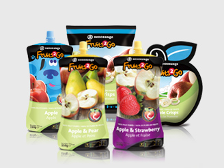
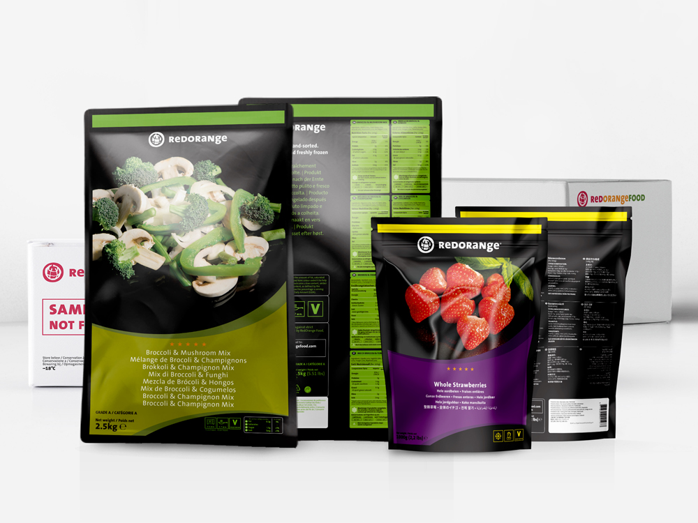
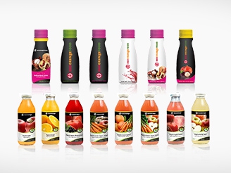
The recent project we did for Smoothie Rebels is one that strongly hit home among us here at yaean as we’re always trying to eat and drink healthy, but we just end up at the milk tea store across the street! If only Smoothie Rebels products were easily available here in China, we’d most likely be concocting amazing stuff at the pantry every day in the midst of this year’s scorching summer.
▲ Smoothie Rebel’s Logo - a color mash-up of all their available flavors
Smoothie Rebels is a Dutch food brand bringing health through frozen fruit. They source their fruits from different origins across the world and all freshly frozen at the origin within 5 hours after picking. Their products are guaranteed safe, carefully selected, and free from any additives, bringing deliciously healthy goodness to their consumers.
The cool thing with Smoothie Rebels is that each box comes with ready-to-blend frozen fruits in sachets perfect for 2 servings of refreshing smoothie treat. Their goal is to inspire people to live more consciously and healthier with
minimal effort.
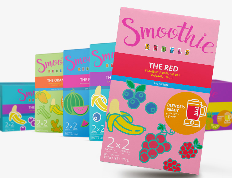
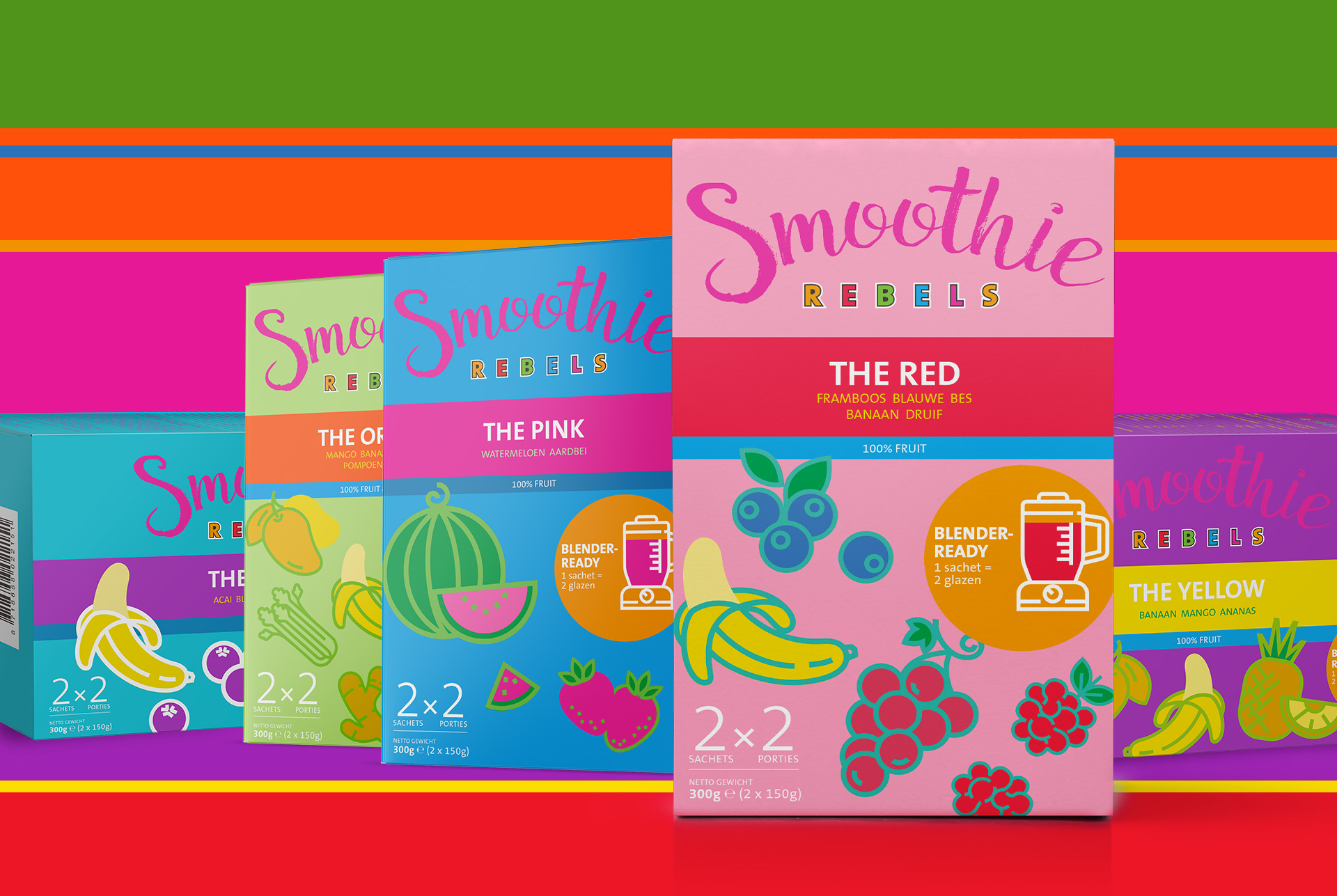
▲ The packaging design for the six Rebels
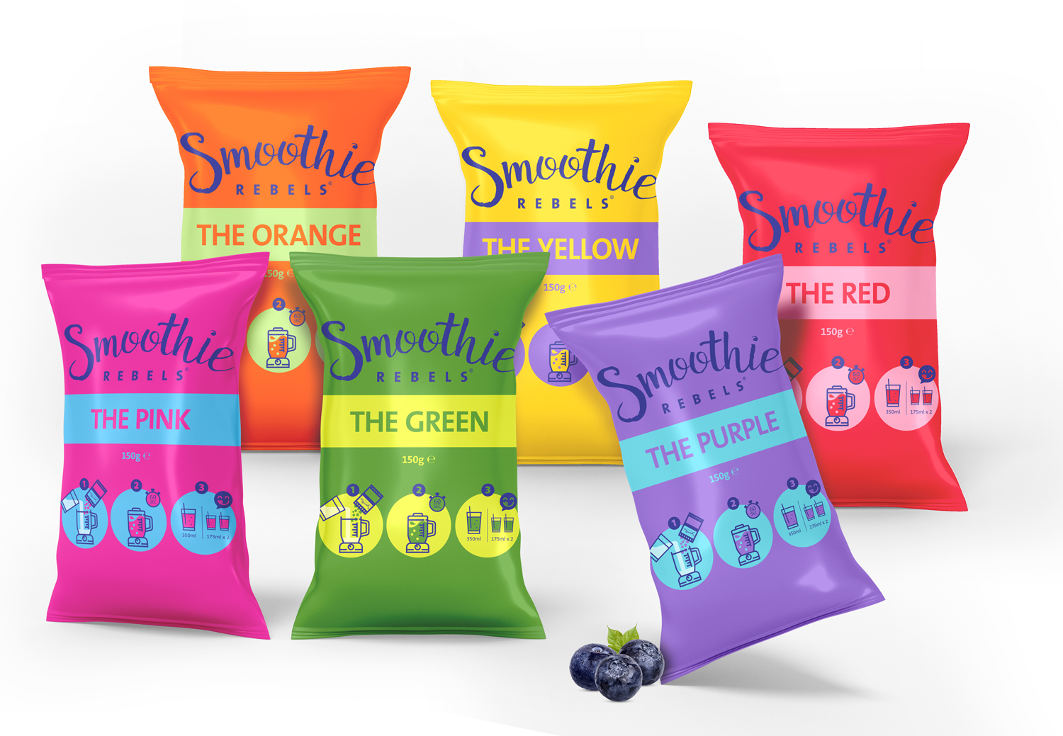
▲ Smoothie Rebels Individual Servings Packaging
Smoothie Rebels has three basic principles to its brand: Happiness, Purity, and Convenience. These inspired the concepts we came up with when we were designing the brand’s logo, packaging, and marketing materials for product launch.
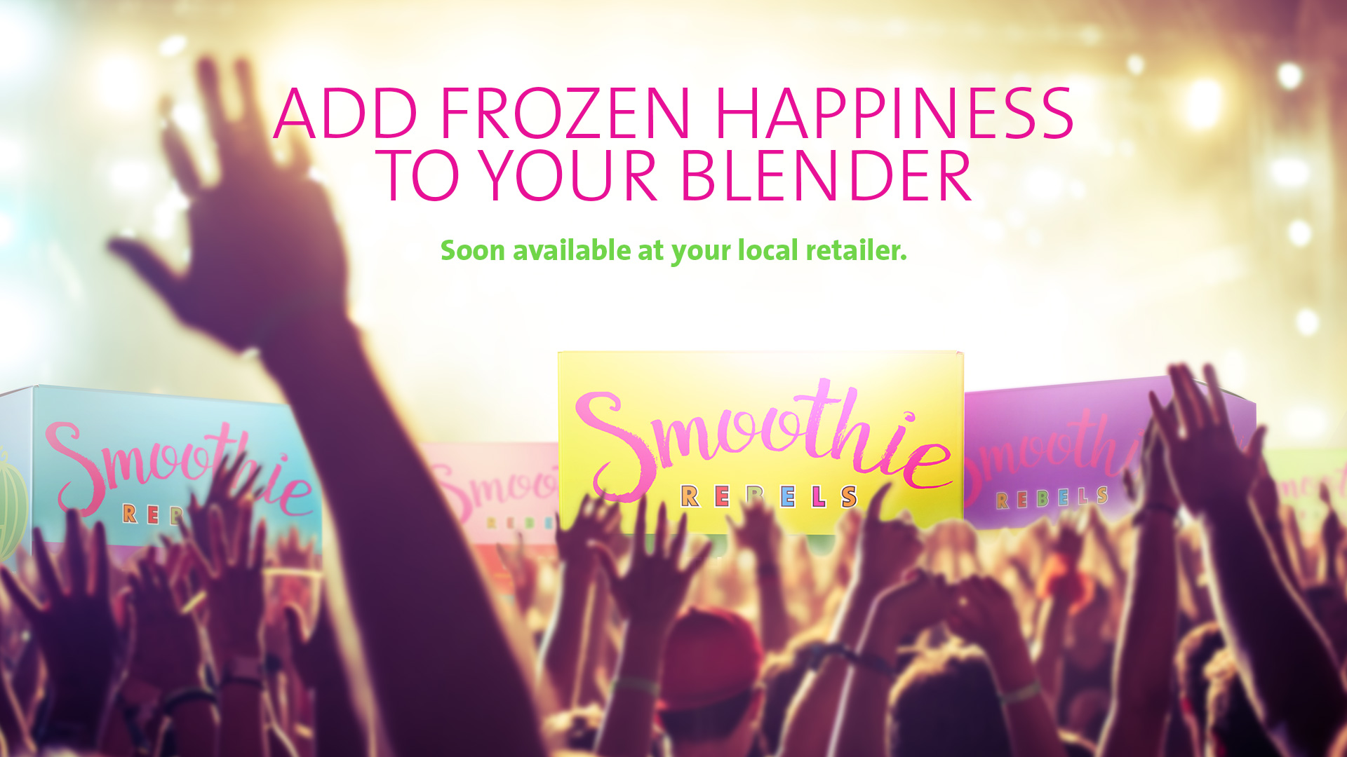
▲ Teaser key visual
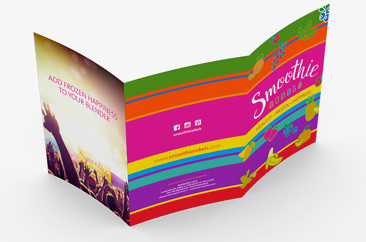
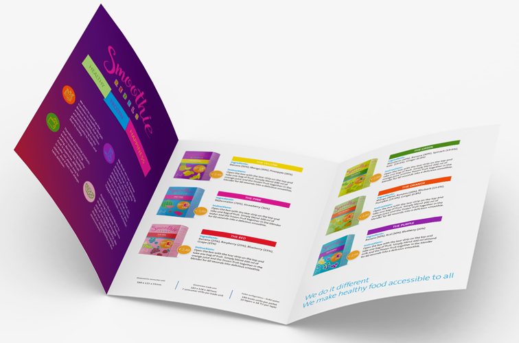
▲ Flyer
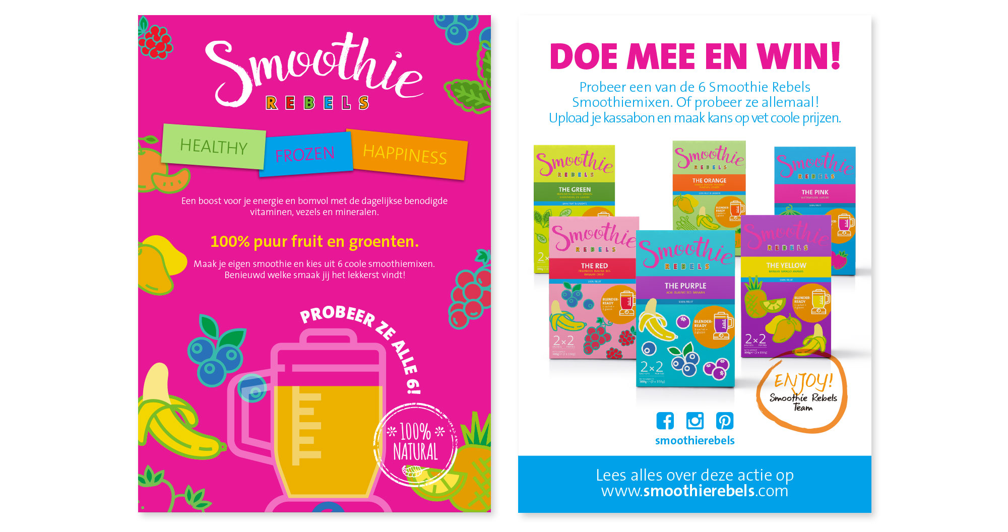
▲ A6 promo insert
We wanted Smoothie Rebels’ visual identity to be fun, uncomplicated, and a standout. We opted to use colors and visual elements that pop to give an edge to the brand but still evoking a sense of encouragement for everyone to try.
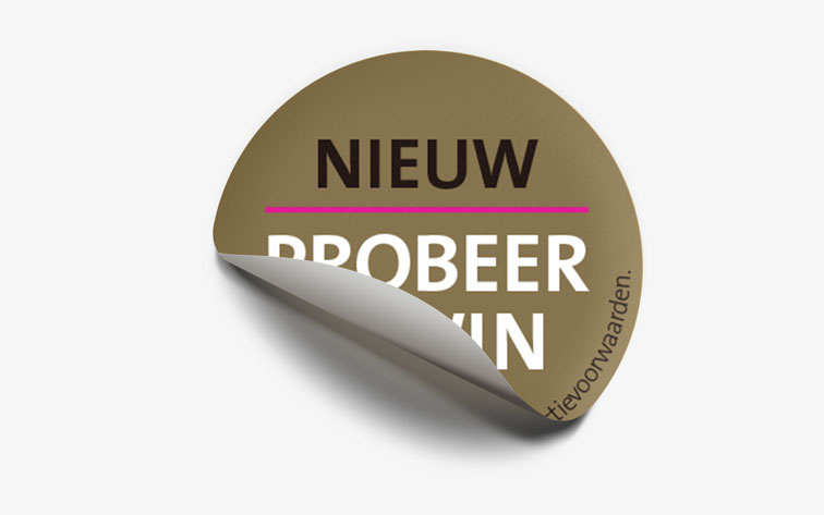
▲ Promo retail sticker


