
Pantone Matching System has been around for decades, used as a standard for defining colours in all forms of design work from graphic design to fashion to home interiors. Throughout the decades this has been a versatile tile and is always a benchmark for colour accuracy. In our work, Pantone is pretty much part of our everyday. We use it in defining colours for printing and even colours for products.
Over the years, we have seen the use of PANTONE widen into more iconic form not only in merchandising but in other creative expressions. Here is a look at a few cool visuals we have seen other designers take PANTONE to the next level.
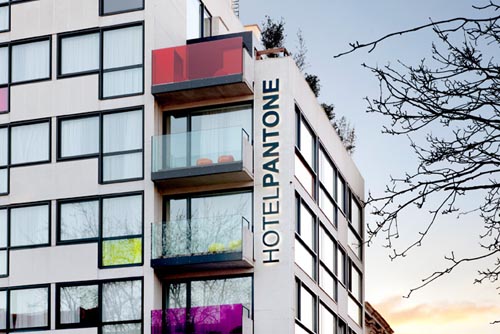
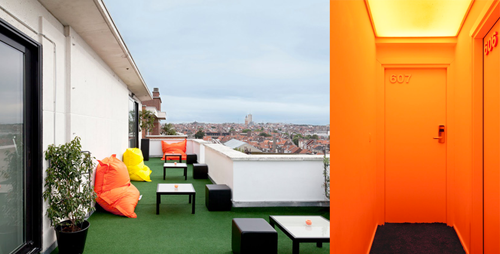
PANTONE HOTEL
A designer’s dream to stay in when in Brussels.
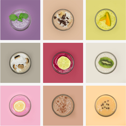
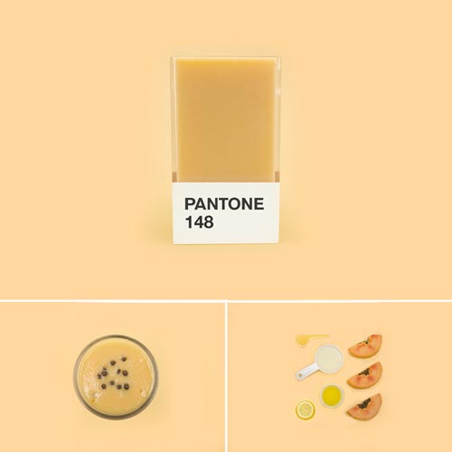
PANTONE SMOOTHIES
The Pantone Smoothies project - a mouthwatering collection of smoothies matched to their Pantone counterpart.
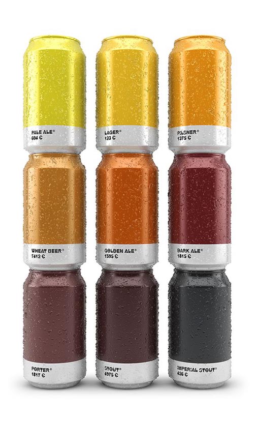
PANTONE BEER
The idea of matching the different types of beer to Pantone is also a clever idea.
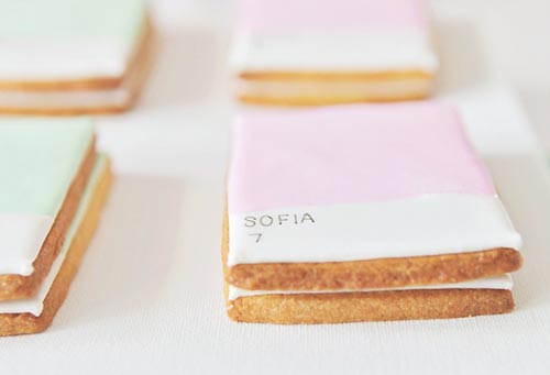
PANTONE COOKIES
Or how about some DIY-inspired by Pantone like these cookies.
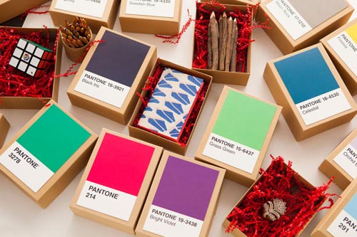
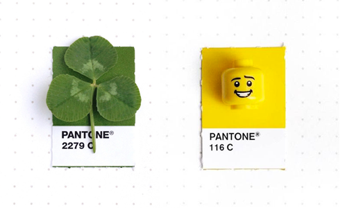
PANTONE OBJECTS
Or how about pairing the colours with a matching tiny object?
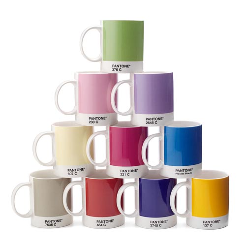
The icon has naturally also made it’s way into merchandising. And being designers, we couldn’t help but add these Pantone mugs to our office in the closest colour we can find to our identity - Pantone 520c, Pantone 2583c and Pantone 2645c.
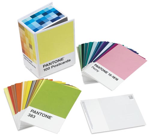
Pantone postcards which I probably would just keep and not send…
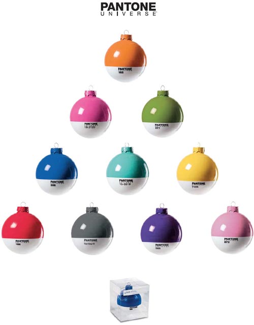
Complete your holiday decors with a collection of Pantone baubles.
There are so many feast for the eyes out there.
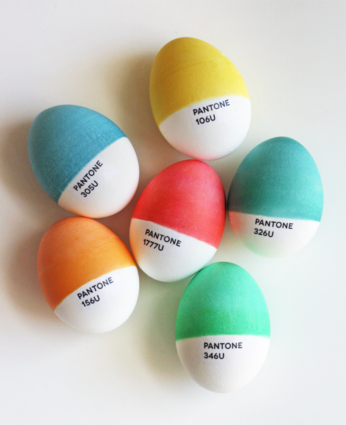
Happy Easter !